这里是通过获取input元素,然后通过它的type属性进行切换,其中browse和eye-close分别是Icon组件中眼睛开与闭,效果如下

文章插图
带 Icon 的输入框通过
prefix-icon和suffix-icon 属性可以为Input组件添加首尾图标 。可以通过
计算属性判断出是否显示首尾图标,防止和前面的clearable和show-password冲突.这里代码做了<template><div class="k-input"><inputref="ipt"class="k-input__inner":class="{ ['k-input--prefix']: isShowPrefixIcon }":disabled="inputProps.disabled"v-bind="attrs":value="https://www.huyubaike.com/biancheng/inputProps.modelValue"@input="changeInputVal"/><div class="k-input__prefix" v-if="isShowPrefixIcon"><Icon :name="inputProps.prefixIcon" /></div><div class="k-input__suffix no-cursor" v-if="isShowSuffixIcon"><Icon :name="inputProps.suffixIcon" /></div></div></template><script setup lang="ts">//...type InputProps = {prefixIcon?: string;suffixIcon?: string;};//...//带Icon输入框const isShowSuffixIcon = computed(() => {return (inputProps.suffixIcon && !inputProps.clearable && !inputProps.showPassword);});const isShowPrefixIcon = computed(() => {return inputProps.prefixIcon;});</script>相关样式部分.k-input__suffix,.k-input__prefix {position: absolute;right: 10px;height: 100%;top: 0;display: flex;align-items: center;cursor: pointer;color: #c0c4cc;font-size: 15px;}.no-cursor {cursor: default;}.k-input--prefix.k-input__inner {padding-left: 30px;}.k-input__prefix {position: absolute;width: 20px;cursor: default;left: 10px;}在app.vue中使用效果如下<template><div class="input-demo"><Input v-model="tel" suffixIcon="edit" placeholder="请输入内容" /><Input v-model="tel" prefixIcon="edit" placeholder="请输入内容" /></div></template><script lang="ts" setup>import { Input } from "kitty-ui";import { ref } from "vue";const tel = ref("");</script><style lang="less">.input-demo {width: 200px;}</style>
文章插图
文本域将
type属性的值指定为textarea即可展示文本域模式 。它绑定的事件以及属性和input基本一样<template><div class="k-textarea" v-if="attrs.type === 'textarea'"><textareaclass="k-textarea__inner":style="textareaStyle"v-bind="attrs"ref="textarea":value="https://www.huyubaike.com/biancheng/inputProps.modelValue"@input="changeInputVal"/></div><divv-elseclass="k-input"@mouseenter="isEnter = true"@mouseleave="isEnter = false":class="styleClass">...</div></template>样式基本也就是focus,hover改变 border 颜色.k-textarea {width: 100%;.k-textarea__inner {display: block;padding: 5px 15px;line-height: 1.5;box-sizing: border-box;width: 100%;font-size: inherit;color: #606266;background-color: #fff;background-image: none;border: 1px solid #dcdfe6;border-radius: 4px;&::placeholder {color: #c2c2ca;}&:hover {border: 1px solid #c0c4cc;}&:focus {outline: none;border: 1px solid #409eff;}}}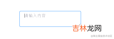
文章插图
可自适应高度文本域组件可以通过接收
autosize属性来开启自适应高度,同时autosize也可以传对象形式来指定最小和最大行高type AutosizeObj = {minRows?: numbermaxRows?: number}type InputProps = {autosize?: boolean | AutosizeObj}
经验总结扩展阅读
-
-
-
-
-
-
-
-
-
-
-
-
-
-
-
-
-
-
-
-
- Vue3实现动态导入Excel表格数据
- Vue3 企业级优雅实战 - 组件库框架 - 3 搭建组件库开发环境
- 带你从0到1开发AI图像分类应用
- 遇事冷静从不主动挑事的三大星座 但也不怕事
- 2023年农历七月廿四宜拜师学艺吗 2023年9月8日拜师学艺行吗
- 2023年9月8日入学好吗 2023年9月8日适合入学吗
- 2023年9月8日堵蚂蚁洞好不好 2023年9月8日堵蚂蚁洞黄道吉日
- 2023年农历七月廿四开学吉日 2023年9月8日开学吉日一览表
- 2023年9月8日堵蚁穴好吗 2023年9月8日堵蚁穴行吗
- 2023年9月8日剪指甲好吗 2023年农历七月廿四剪指甲吉日